Meta Case Study
Killed a 45-slide PDF. Built this instead.
What happens when a product designer treats their own job search as a product problem.
Context
The old portfolio was a 45-slide PDF. It didn't match how I work.
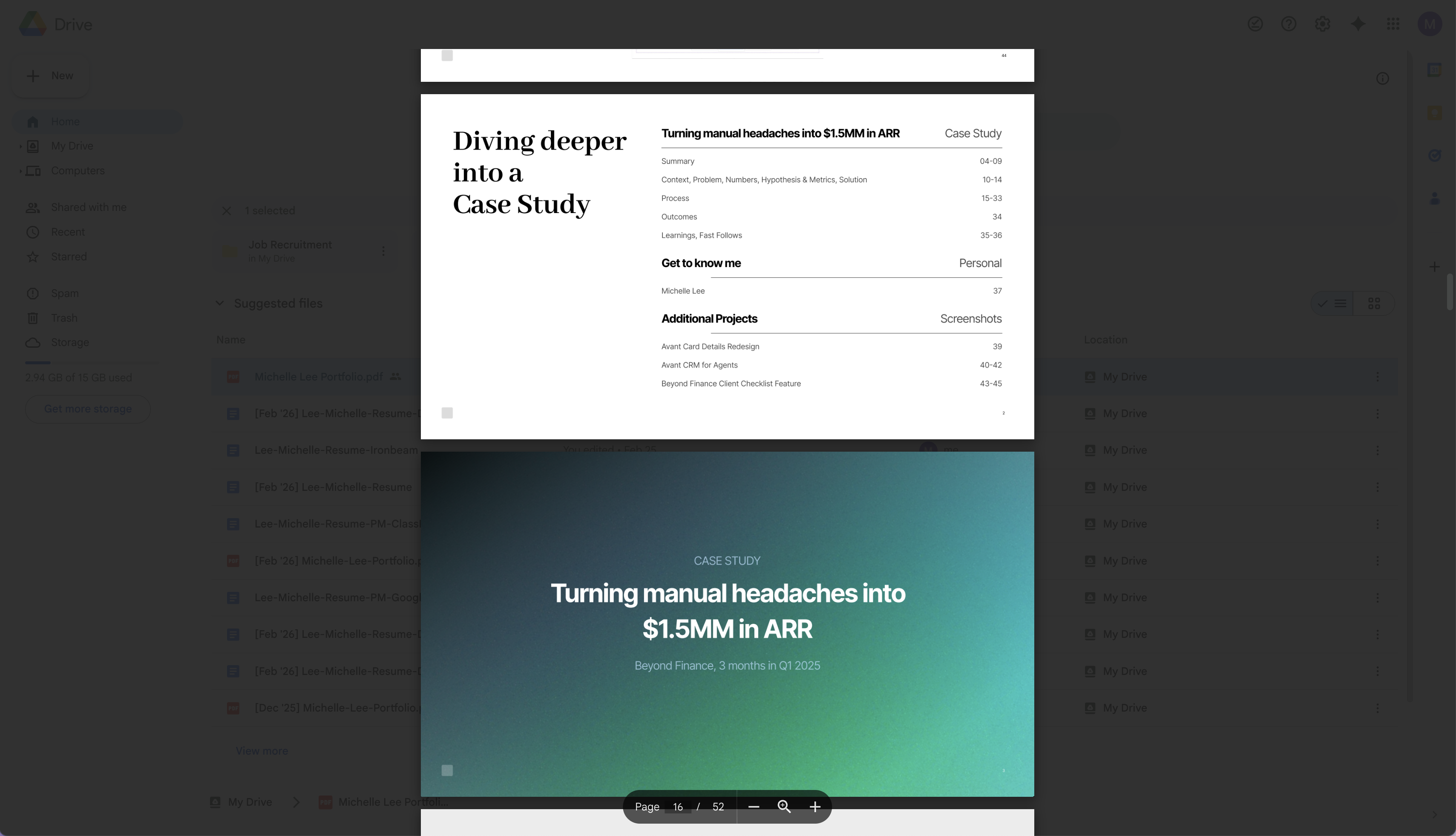
My previous portfolio was a linear PDF deck. Forty-five slides of process documentation: research plans, persona docs, competitive analyses. It proved I could follow steps. It didn't prove I could think.
The problem
Process documentation masquerading as design thinking.
The deck walked through every phase of every project with equal weight. No hierarchy of decisions. No stakes. No evidence of judgment. It was thorough the way a homework assignment is thorough.

The old portfolio
45 slides of process documentation. Every project got the same treatment regardless of impact.
The gap
Portfolios I admired looked nothing like mine.
The portfolios that got people hired at strong companies shared the same shape. Visual confidence came first, not process documentation. Real before/after comparisons carried more weight than screenshots of deliverables. And the designers who included failure stories read as more senior, not less.
The bet
If I built the portfolio as a web product using the same tools I'd use at work, the medium itself would be proof. Stop documenting the process. Demonstrate the judgment.
Building This Portfolio
Strategic Bets
Five decisions that shaped everything.
Every portfolio is a hundred decisions. Most don't matter. These five did.
Kill the PDF entirely
A product designer’s portfolio should be a product, not a document. Building it in Next.js is the proof — not a line about knowing Next.js.
Depth over breadth
Two deep case studies instead of six shallow ones. Each follows the story of what was broken, what I bet on, what shipped, and what happened. Not the standard Research, Design, Test, Ship template.
Include the failure
Recess Sports didn’t work as a business. Showing that honestly, with a real diagnosis and a real pivot, signals more seniority than three polished success stories.
Bet 04
“Terminal meets Consumer” visual direction
The visual direction had to feel like it came from someone who ships, not someone who presents. Dark backgrounds and monospace labels carry those signals. The font stack reinforces it: Space Grotesk for authority, DM Sans for reading, JetBrains Mono where precision matters. Taken together, the aesthetic says “builds products” rather than “makes Dribbble shots.”
Bet 05
Voice as differentiator
The hardest sentence to write is one that sounds like you and no one else. I read every paragraph of this portfolio out loud. If it could have come from a template, I cut it. If it sounded like a job posting, I rewrote it until it sounded like a person.

Figma source file
The goal was 0 to 1 in four days. I scoped to what was necessary, shipped in code, and iterated from there. Knowing what to skip is a PM instinct, not a design shortcut.
What I Cut
The portfolio is defined by what's not in it.
Cutting was harder than adding. Every omission was a deliberate bet that the work would speak louder than the scaffolding around it.
No "My Process" section
Process sections are filler. If the case studies don’t demonstrate process through the work itself, a labeled diagram won’t fix that.
No persona docs or journey maps
These artifacts prove you used a template, not that you understood users. The case studies show user understanding through the product decisions it drove.
No competitive analysis slides
Listing competitors in a 2×2 matrix is not strategic thinking. The case studies show why I built a demand engine when everyone else was building supply tools.
How I Built It
Claude as design partner, not autocomplete.
I used AI throughout this build, not to generate the portfolio but to pressure-test it. Claude helped with research synthesis, copy editing, and debugging. The strategic decisions were mine. AI just kept me moving.
Studied portfolios that got people hired
Analyzed what design leaders at top companies actually showed. Identified the pattern: visual confidence, narrative structure, and honest failure stories outperformed process documentation every time.
Component system built for case studies
Reusable section shells, scroll-triggered reveals, alternating backgrounds, lightbox images. Every case study uses the same primitives. Consistency through shared components, not copy-paste.
Next.js 14 + Tailwind + Framer Motion
The same stack I’d use to build a real product. Server components for metadata and SEO. Client components for animation. No template. No Squarespace. Line by line.
The Structure
Every case study follows the same arc.
Traditional portfolio structure leads with research and buries the interesting parts. I flip it: show the solution first, then earn the reader's attention for how I got there.
The Solution
Lead with the work. Show what I shipped before explaining why. Let the reader see the craft first, then earn their attention for the story behind it.
Context & Problem
Now that you’ve seen the solution, here’s why it needed to exist. Specific friction, quantified stakes, the situation that made this worth building.
Research & Discovery
What I learned and how I learned it. User insights, competitive gaps, data that shaped the direction. The evidence behind the decisions.
Iterations
What the work looked like before it was done. Every version changed something. Showing the progression reveals judgment, not just polish.
Learnings
What worked, what didn’t, and what I’d do differently.
Outcomes
Built in four days. Ships as proof every time someone opens the link.
Days to ship
Deep case studies
PDF slides
Reusable components
Before
After
The strongest outcome isn't a number. It's this: every component, every animation, every line of copy on this site is something I built and decided. The portfolio doesn't describe product design skills. It is one.